

Duration: 12 Days
Team: Solo Project
Role: Research, Plan, Design,
Toolbox: Sketch (Design), InVision (Prototyping) Miro (planning), Pencil and Paper
Mox Boarding House
Objective
Encourage online shoppers to visit a small business's website and shop online at their store instead of larger online retailers.
Challenge
Existing business was unaccustomed to e-commerce, so the entire online store needed to be rebuilt. Due to the COVID-19 crisis, speed of delivery was critical to the business's survival.
Result
A welcoming and intuitive website that captures the unique brick and mortar style enjoyed by many long time customers, while creating a well organized store page that attracts new consumers.


The Process
![research, black and gold[Converted].png](https://static.wixstatic.com/media/56f0d2_308eb8496d624f5e97b17efe9959b0a6~mv2.png/v1/fill/w_123,h_123,al_c,q_85,usm_0.66_1.00_0.01,enc_avif,quality_auto/research%2C%20black%20and%20gold%5BConverted%5D.png)
Learn
Competitive-Comparative Analysis
Instore experience Analysis
Customer Interviews
Ask
User Interviews
Usability Test
Card Sort
Understand
Affinity Map
Personas
User Flows
Redefine the Problem
Design
Figma Wireframing
Figma Prototypes
Sketch Branding & Moodboards
Site Maps
Navigation Flows
User Testing


Learn: An Introduction to Mox
![research, black and gold[Converted].png](https://static.wixstatic.com/media/56f0d2_308eb8496d624f5e97b17efe9959b0a6~mv2.png/v1/fill/w_103,h_103,al_c,q_85,usm_0.66_1.00_0.01,enc_avif,quality_auto/research%2C%20black%20and%20gold%5BConverted%5D.png)
Mox Boarding House is an established game store in the Pacific Northwest, they have two locations in the Seattle Metro Area and were just about to open a new location in Portland when the Coronavirus arrived in the US. Their business model is to create a welcoming place for people to not only buy games but to play the games too. This model is perfect for pre-covid times, but at the start of lockdown, they were struggling on how to continue to build.
Initially, we weren't too worried. We thought the store would be closed for 2 weeks, we would reopen and go back to business as usual. Then 2 weeks turned into a month, and we had to do something. We knew we couldn't compete with Amazon so we focused on food, and relied on loyal customers to continue ordering games.
"
"
Anonymous Employee
After looking over the website I could see indications of their move to a new model. There was an online store but it was entirely focused on the food. Users would have to dig into the site navigation to find the games, and the list felt incomplete. If I was a loyal customer trying to order a game I would be frustrated and tempted to shop elsewhere. Not to mention any of the other shortcomings with this website. The challenge was to design a website that would not only keep customers engaged during the worse of Coronavirus but also bring new people into the store once things returned to normal.
Reviewing the Original Site:
Pros-
-
Clear branding, style, and identity
-
Information is clearly displayed
-
Pages are well organized
Cons-
-
Colors are dark, links are in gold and hard to read against the background
-
Pictures are dark, showcasing empty rooms
-
No images of people engaging in the games
-
Navigation is confusing and the online store is hard to find.

Overall this website appears to be built for a completely different business. The dark rooms with menus being the prominent feature evoke a feeling of an up-scale restaurant, while the name Boarding House, and higher priority of Locations, Rooms, and Events over store could lead potential new customers to think they are on a hotel's website.
-
Websites are polished; developed and managed by teams of pros
-
Products have detailed summaries, tags, photos, and plenty of user reviews
-
Navigation is simple and robust, reflecting the many products they have
-
Style and tone are minimalistic colors are often neutral tones
Checking Out the Competition
The Pacific Northwest has a nerdier culture than other parts of the US, as a result, board game stores and game cafes are more common. The competition between these stores is fierce and their business is usually supported by a key group of loyal customers. Their business is focused on the local metropolitan area. With Covid forcing many of their customers to shop online, they now have to compete with online retailers. I examined their competition to see what I could learn from their sites and how to design something that could stand against both local and online retailers.


Local Game Stores
Online Retailers
-
Most of the websites look like they were designed and maintained by the owner
-
Stores display little information and rarely offer reviews
-
Information and events are often out of date; the designs incorporate antiquated conventions
-
The websites show a lot of character often reflecting the interests of the owner or images of their favorite games
-
The colors, styles, and images are aggressive and dominant
Impression
After reviewing both styles of business I found similar results as often found comparing any small business to a national chain. The small businesses show more passion and character but aren't as well maintained. The larger stores come off as cold and detached from the products, yet designed to maximize flow and the shopper's experience.
.jpg)


Visiting the Store
Halfway through the project, Washington State relaxed Covid safety measures and retail stores were permitted to reopen. I took advantage of this opportunity to visit both of their stores. I was able to understand how the games were organized as well as the in-store experience.
Impressions
-
The game store and playing spaces dominate the building with the restaurants being a secondary feature
-
Lots of natural light and bright colors
-
Games are well organized but use jargony names that casual shoppers won't recognize.
-
Employee recommendation cards next to each section like a book store
-
Quirky Art and decorations give off a playful atmosphere
What stood out most was customer service. The staff is extremely knowledgeable about games and obviously have a clear system to help people find what game they want out of the hundreds on display across the store. This is something that can help them stand out against international retail giants.

Ask: Talking to Customers
Using social media and my personal network I found eleven people to interview for this project who I divided into three groups.
Loyal Customers
People who are familiar with the store, used to frequent the store weekly or monthly to play games, eat the food, and shop. They have tried to use the site to order games and products during lockdown. Their opinion is important as the store wants to keep them engaged, but they also have biases associated with the store.


Gamers
Fans of board games who have been to similar stores but are unfamiliar with this location. Their opinion would not have any bias towards the store.

Casual Shoppers
Not board gamers, but they could visit the store to buy a game for a friend or family member. Their opinion helps construct a robust store that will be accessible to everyone, and may attract new customers.
My remote interviews were structured to three tasks that would allow a better understanding the goals and frustrations of users and online shoppers.
Understand their E-shopping Habits
A 20-minute interview revealed how each user currently shopped online and how they would prefer to shop.

Examine Current UX
Each user visited the current website and attempted to order a sandwich for take-out to understand their journey through the site.
Experiment with Navigation
Through card sorting, users organized games into categories to determine how they would try to find these products in a store.

Shopping Habits
When asked about their online shopping habits, people initially split three ways. However, when asked who they most recently ordered from I realized that online shoppers like to say they support small businesses and manufacturers, but not as many users actually act on that.
Who users prefer to buy from


Who users most recently ordered from
Users prefer Amazon and similar retailers because they know they can find the product and trust that it will be delivered to them. Having same/next day delivery is a bonus.
Locally Mox could compete with delivery speeds with either store pick-up or, if Mox has the resources, offer delivery.
The main point here is that navigation and trust are key issues that would need to be addressed if they wanted to compete with online retailers.
Opinions on Current UX
Users identified navigation as a problem. They couldn't easily identify the store and were confused further when they weren't able to find merchandise other than food.
A few users unfamiliar with the store didn't understand what the business was when they first opened up the website, if they were potential shoppers they would assume they were on the wrong site and leave.
I was also interested in the main goal gamers have when they visited a store's website. I discovered that e-shopping was less of a priority. This data was referring to pre-covid trends but was something to keep in mind as I wanted to make a website that would survive in the post-covid world.

Store Inventory Sorting
Card sorting demonstrated that most users would group games by type and genre, such as science fiction and mystery.
Understand: Applying the Data

After processing all of the interviews I started to build personas. I opted to build two personas for this project to represent the gamers and casual shoppers. These would be used to help understand and empathize with users so the redesign would both retain current users and also attract new users to the store.
Mini Personas

Becca
Board Game Fan
-
Pre-Covid would visit website to check for events, deals, news, and clubs
-
Prefers shopping in person, likes to browse games
-
Wants to know more about the game before buying and likes to see pictures of what's included. Gets reviews and recommendations from community and friends
-
Annoyed by hidden prices and missing information

Carlos
Casual Shopper
-
Never visited the store before, but wants to support local businesses
-
Either knows exactly what they are shopping for or wants recommendations
-
Values the reviews of the product on the store page
-
Confused by gamer jargon like "Deck Builder" or "Euro"
-
Quick to click away if website doesn't look right or has pop ups
With a better understanding of the users, there are additional questions necessary to shape the redesign.


How might we encourage Becca to continue shopping with us while attracting Carlos to our store?
How might we enable Carlos to directly find what he's looking for while encouraging him to spend more time browsing the store?
How might we display all the information Becca needs to trust what she's buying?

Design, Test, and Iterate
Branding and Style
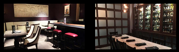
One of the primary concerns from casual visitors echoes their concerns about visiting these types of stores in-person, that they are unapproachable. The website style needed to change; the initial site was too dark and didn't echo the style of the physical store. Using some photos of the interior of the store I was able to present a more neutral color scheme that I would use for the website, while still leveraging their recognizable logo.


Revisions
One of the biggest changes was incorporating more negative space. The original website had a solid black background which came across as too forbidding or exclusive for casual gamers or shoppers. Having more white in the background makes the page more approachable. I changed the photos from displaying spacious empty rooms to photos with customers shopping, playing games, and enjoying the food.
Navigation
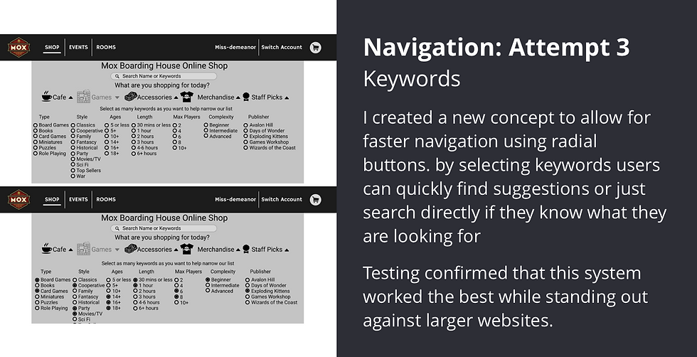
Initial interviews and research identified navigation as a key problem for many small businesses, including Mox. I wanted to find an innovative way to allow the user to locate their product and encourage browsing.
The site's general navigation was handled on the top navigation bar. The original bar directed users to Home, Locations, Events, Rooms, Blog, Shop, and About. I reworked it to emphasize the shop more and reduce redundancies in their central navigation by adding the blog to the about page and locations are on the homepage. A condensed navigation bar also helps with making the design more responsive.
Original
New Design
After general navigation covered, I focused on store navigation. This is probably the most important aspect of the redesign as it will keep users returning to the online store during the lockdown and future Covid restrictions.


Customer Service
From my research, one of the biggest draws for small businesses is the personal touch and expectation of better customer service. My experience visiting the two stores in Seattle confirmed their employees are extremely knowledgeable. That in-person experience is something I wanted to show on the website.
My initial thought was to take inspiration from the store. On the game shelves, there is space dedicated for the employees to recommend a product. They write out a review and place it under the game box where everyone can read it. For the website, my initial idea was to have the bottom of every page dedicated to "Staff Picks". The store page would depict the top three staff picks with employee written recommendations displayed below. The games would change to meet the tags selected by the user in the navigation scheme shown above.

User Feedback:
With a completed high fidelity prototype, I went back to my original interviewees, asking them to tear apart my redesign and offer feedback.
Raves
-
Employee recommendations is a great way to stand out as not just a game store but being game experts
-
Page navigation is concise, users could easily find the store and events sections
-
New pictures and color scheme help portray the store as an experience not just a shop
Rants
-
The card navigation system, while creative, was too much for users, they preferred a more straightforward navigation
-
The descriptions on the store page were too small and dark
-
Staff recommendations were placed in an area most users assume ads will go, so they were ignored
Latest Home Page Iteration
-
Pictures show people enjoying the store encouraging users to come and join in on the fun
-
Flat design makes the website flow easier while CTAs are still prominent
-
The client has requested a prominent space for updates and news as the covid crisis continues

Reflection, Next Steps.
I learned the value of user interviews. Without incorporating their insight into my design, I would have missed the importance of simple navigation and the benefit of employee recommendations on the experience. Visiting the store in person was a valuable experience and resulted in a better representation of the store on the website. Testing navigation flow on multiple iterations led to an innovative system for customers, reducing the pain point of getting overwhelmed by a store page.
In retrospect, a simple design is often more effective than a "fun" but complicated one.
View the Prototype: